--> How To Make Embedded Google Maps Responsive? | Experience Lab - Online business creation and development guide for bloggers and startups

How To Make Embedded Google Maps Responsive?

Integrating maps with your web projects can offer your visitors a more interactive experience of your website, and assist with the understa...
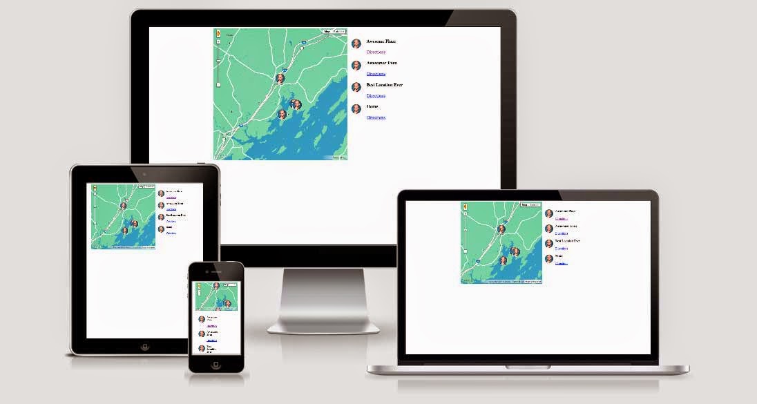

Responsive Google Maps


Integrating maps with your web projects can offer your visitors a more interactive experience of your website, and assist with the understanding of events and places. Maps often become relevant to your content, no matter the genre. Embedding Google maps on your website is easy, but often times, just copying and pasting a piece of code is not the answer. If you embed maps a lot on your website, you might want to make them responsive to be consistent with your website.


We have already shared tutorial(s) for embedding maps on your website;


If you don't wanna read the tutorials, it's simple; Open Google maps and zero in on a location you want to show on your site. Click the cog (gear) icon in the lower right corner and choose the Share and embed Map option.


You will then be presented with an embed code that you can modify and paste on your website. Simple.


The default embedded map, however, will not be responsive. It has fixed proportions, and if you open the page on a mobile device, the map probably won't fit. In my experience, not a good prospect, because scrolling down or sideways often results in panning the map instead of scrolling the page - very annoying.


Making maps responsive


The default map looks something like this;


<iframe src="https://www.google.com/maps/embed?pb=!1m14!1m12!1m3!1d26081603.294420436!2d-95.677068!3d37.06250000000001!2m3!1f0!2f0!3f0!3m2!1i1024!2i768!4f13.1!5e0!3m2!1sen!2s!4v1406226634658" width="600" height="450" frameborder="0" style="border:0"></iframe>


As you can see, the height and width parameters are explicitly defined. No matter what screen you're using, the map will use the exact same number of pixels.


If you wish to transform this static sized Google Map into one that is responsive, all you have to do is add a few CSS rules to your web page and wrap the embed iframe inside these rules.


The CSS with responsive style would look something like this. You can change the value of padding-bottom (line #4) from 75% to something for a different aspect ratio.


<style>

   .google-maps {

      position: relative;

      padding-bottom: 75%;

      height: 0;

      overflow: hidden;

   }


   .google-maps iframe {

      position: absolute;

      top: 0;

      left: 0;

      width: 100% !important;

      height: 100% !important;

   }

</style>


Now, all that remains is for you to apply this CSS style to the map iframe.


<div>

   <iframe src="https://www.google.com/maps/embed?pb=!1m14!1m12!1m3!1d26081603.294420436!2d-95.677068!3d37.06250000000001!2m3!1f0!2f0!3f0!3m2!1i1024!2i768!4f13.1!5e0!3m2!1sen!2s!4v1406226634658" width="600" height="450" frameborder="0" style="border:0"></iframe>

</div>


That's it! You can use a similar technique for photos and videos as well. Remember to add the CSS style within the <head> section of your website, or else it won't work.

COMMENTS

Name

Affiliate Marketing,12,Announcement,34,Bing,9,Bitcoin,38,blog,7,Blogger Resources,42,Blogger Templates,4,blogger tricks,156,Blogging ethics,70,Blogging tips,198,Bugs and Errors,34,Business,9,Copyright Violation,9,CSS and HTMLTricks,95,Designs,8,drop down menu,7,eBook,12,Email Marketing,7,Events,30,Facebook,30,Facebook tricks,49,Google,157,Google AdSense,42,Google Analytics,7,Google Plus,51,Google Plus Tricks,38,Guest Posts,112,home,2,How To,77,Internet,1,JSON Feeds,25,Kitchen Recipes,2,Label Based Sitemap Themes,1,Make Money Online,108,Marketing,16,MBT Blogger Templates,7,Menus,1,News,146,Pages,1,Posts,10,presentations,15,Responsive,10,Reviews,7,SEO,307,Settings,6,Shortcode,15,Sitemap Themes,1,Social Media,155,Technology,7,Templates,1,Tips,2,Tools,1,Traffic Tips,80,Video,19,Web Designing,62,web hosting,18,Webmaster Tools,97,Widgets,199,wordpress,26,
ltr
item
Experience Lab - Online business creation and development guide for bloggers and startups: How To Make Embedded Google Maps Responsive?
How To Make Embedded Google Maps Responsive?
https://blogger.googleusercontent.com/img/b/R29vZ2xl/AVvXsEgJ2buq356hUAkfZpROvl58CX0BpFd0KnadHVXpPWV87-6xLkBZD85XoOtl8ho9EYw-a7ANddgG4ljT8ijZ8fb05UPms5tQJ7VJfZ9tCbB3-QB8fqYIOIRFWJVb1wB9hUpoe4WuUIBKWISo/s1600/responsive+Google+maps.jpg
https://blogger.googleusercontent.com/img/b/R29vZ2xl/AVvXsEgJ2buq356hUAkfZpROvl58CX0BpFd0KnadHVXpPWV87-6xLkBZD85XoOtl8ho9EYw-a7ANddgG4ljT8ijZ8fb05UPms5tQJ7VJfZ9tCbB3-QB8fqYIOIRFWJVb1wB9hUpoe4WuUIBKWISo/s72-c/responsive+Google+maps.jpg
Experience Lab - Online business creation and development guide for bloggers and startups
https://www.experiencelab.info/2014/07/how-to-make-embedded-google-maps.html
https://www.experiencelab.info/
https://www.experiencelab.info/2014/07/how-to-make-embedded-google-maps.html
true
2959477579779989044
UTF-8
Loaded All Posts Not found any posts VIEW ALL Readmore Reply Cancel reply Delete By Home PAGES POSTS View All RECOMMENDED FOR YOU LABEL ARCHIVE SEARCH ALL POSTS Not found any post match with your request Back Home Sunday Monday Tuesday Wednesday Thursday Friday Saturday Sun Mon Tue Wed Thu Fri Sat January February March April May June July August September October November December Jan Feb Mar Apr May Jun Jul Aug Sep Oct Nov Dec just now 1 minute ago $$1$$ minutes ago 1 hour ago $$1$$ hours ago Yesterday $$1$$ days ago $$1$$ weeks ago more than 5 weeks ago Followers Follow THIS PREMIUM CONTENT IS LOCKED STEP 1: Share. STEP 2: Click the link you shared to unlock Copy All Code Select All Code All codes were copied to your clipboard Can not copy the codes / texts, please press [CTRL]+[C] (or CMD+C with Mac) to copy